


 contact@synergytop.com
 +1 619-349-4911


There are hundreds of mobile screen sizes available in the market today. And as many (if not more) tablet sizes, desktop sizes, and laptop screen sizes.
You – as a business owner – cannot guess which device your potential audience would use to access your website.
Also, you want your website to look and feel good on all devices, right?
So this means you need a responsive website – a website that loads and displays perfectly on all device types and screen sizes.
What exactly are responsive websites? Do you really need them? How do you get them? Find answers to all these questions right here.
In this blog, we will cover:
- What is a responsive web design?
- Why is responsive web design important?
- How to make responsive web design?
- Responsive web design best practices
- Responsive web design services
Let’s dive deep into the world of responsive web design.
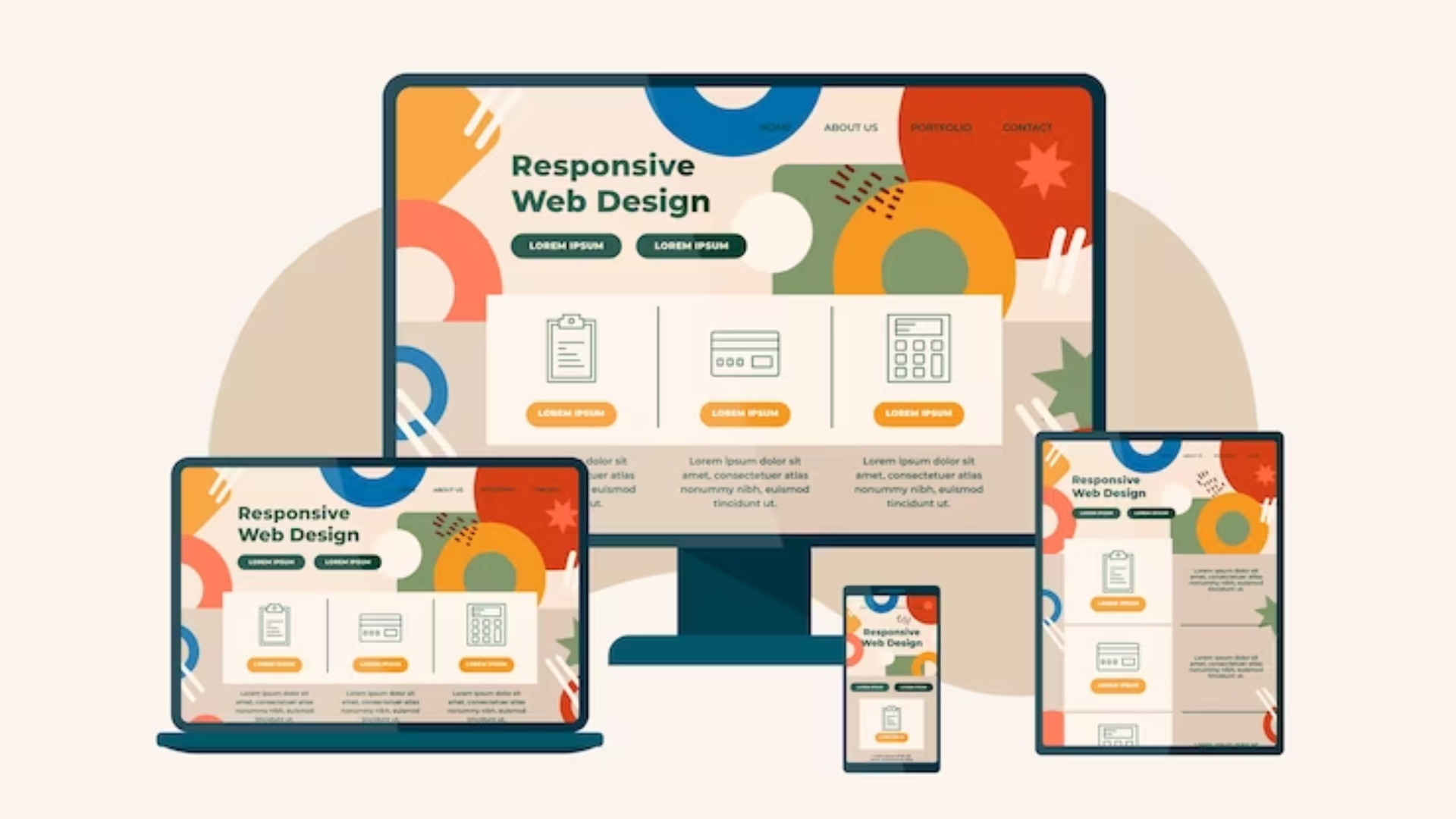
What Is A Responsive Web Design?
While “Responsive websites” has become a buzzword today, a lot of people still wonder, ‘What is responsive web design?’
Here is what is the meaning of responsive web design:
| It is a design approach aimed at crafting websites to provide an optimal viewing and interaction experience across a wide range of devices, from desktop computers to mobile phones and tablets. |
Simply speaking, the website should be able to dynamically adjust its layout and content to fit the screen size. This ensures readability, usability, and overall user experience, irrespective of the device being used.
Isn’t that how traditional websites are built?
Well, it might sound strange, but traditionally, there was little to no need for responsiveness in websites.
There were limited screen sizes.
Even when the number of screen sizes increased, ‘adaptability’ was a quick solution.
What is adaptability now? Is that not what responsive web design is?
Not really.


