


 contact@synergytop.com
 +1 619-349-4911


There are hundreds of mobile screen sizes available in the market today. And as many (if not more) tablet sizes, desktop sizes, and laptop screen sizes.
You – as a business owner – cannot guess which device your potential audience would use to access your website.
Also, you want your website to look and feel good on all devices, right?
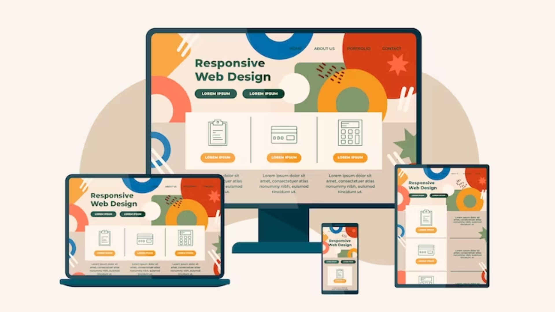
So this means you need a responsive website – a website that loads and displays perfectly on all device types and screen sizes.
What exactly are responsive websites? Do you really need them? What are responsive web design best practices? Find answers to all these questions right here.
In this blog, we will cover:
- What is a responsive web design?
- Why is responsive web design important?
- How to make responsive web design?
- Responsive web design best practices
- Responsive web design services
Let’s dive deep into the world of responsive web design.
What Is A Responsive Web Design?
While “Responsive websites” has become a buzzword today, a lot of people still wonder, ‘What is responsive web design?’
Here is a definition of responsive web design:
| It is a design approach aimed at crafting websites to provide an optimal viewing and interaction experience across a wide range of devices, from desktop computers to mobile phones and tablets. |
Simply speaking, the website should be able to dynamically adjust its layout and content to fit the screen size. This ensures readability, usability, and overall user experience, irrespective of the device being used.
Isn’t that how traditional websites are built?
Well, it might sound strange, but traditionally, there was little to no need for responsiveness in websites.
There were limited screen sizes.
Even when the number of screen sizes increased, ‘adaptability’ was a quick solution.
What is adaptability now? Is that not what responsive web design is?
Not really.
Adaptable vs. Responsive Web Design
Adaptable website design means creating different website versions for different devices and screen sizes.
Responsiveness or responsive web design, on the other hand, means developing a single website that renders perfectly on different device types and screen sizes.
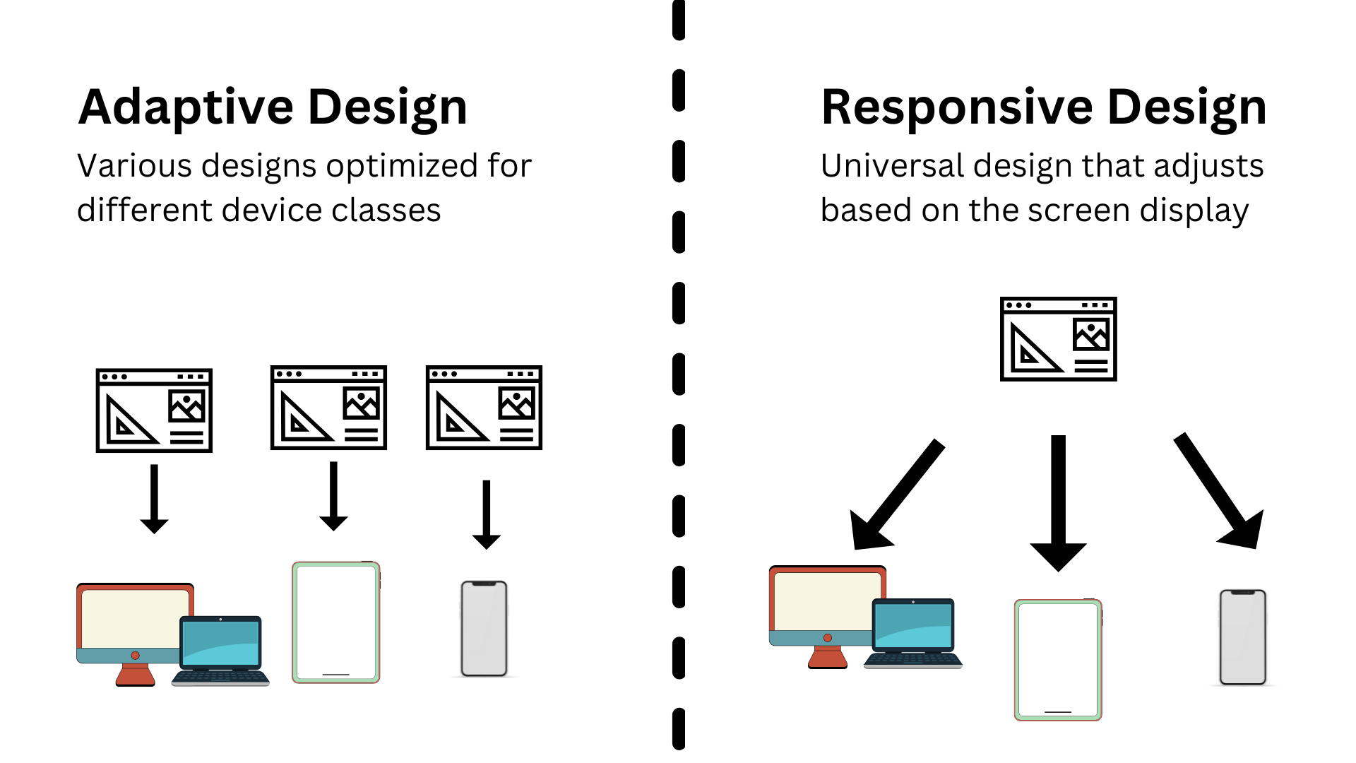
Responsiveness essentially overcomes the fallacies of adaptable website design i.e. having to maintain a huge number of websites.
Now let’s explore the other benefits getting responsive website design services.
Why Is Responsive Web Design Important?
Responsive web design needs specific efforts and resources. And it costs money.
But should you spend that money? What is the purpose of responsive web design?
Well, there are several advantages of responsive web design. Let’s explore some of them:
1. Accessibility
This is the key benefit of responsive web design. A responsive website design ensures that your website is accessible across various devices and screen sizes.
No matter what kind of audience you are catering to – iPhone or Android users, laptop or desktop users, or tablets or iPad users – your website will offer a seamless user experience.
2. User Experience (UX)
Users today don’t limit their Internet endeavors to a single device or screen. People can start looking for someone while on the go – using their mobile devices and then do detailed research about that later on, on their laptops or desktops.
Having a responsive website design enhances user experience by providing consistent and optimized performance across devices.
Also, users expect websites to load quickly and be easy to navigate regardless of the device they are using. Responsive design ensures that users can easily find what they are looking for without having to zoom in or scroll excessively. All this significantly contributes to user experience (UX).
3. SEO Benefits
Remember ‘adaptable website design’, which we discussed previously?
Well, one of the main disadvantages of adaptable design is that it creates duplicate content.
SEO crawlers don’t understand that different versions of your website are for different screen sizes. All they see is a bunch of sites with the same content. And they don’t like it. So your rankings go down.
Responsive design counters this problem. And goes one step ahead in improving search engine visibility and rankings.
How?
Search engines like Google prioritize mobile-friendly websites in their search results.
Responsive websites that provide a seamless user experience across devices are more likely to rank higher in search engine results pages (SERPs) compared to non-responsive websites. This also results in increased organic traffic and better visibility.
4. Cost-effectiveness
As we mentioned earlier, adaptable websites are hard to maintain simply because there are so many versions.
Responsive design reduces the need for separate mobile and desktop versions of your website, saving time and resources. All you need to do instead is invest in a single responsive web design.
Now that we have understood the benefits of responsive web design, it is time to see how to make responsive web design.
How To Make Responsive Web Design
Imagine you want to create a responsive web design landing page.
The requirement is fairly simple: You need a landing page that displays perfectly on all types of devices and screen sizes.
But how do you achieve that? As a business owner who won’t be coding the website yourself, you need to work with a responsive web design company.
Responsive web design services offered by a responsive web design company can help you skip the tension about responsive website design.
However, let’s explore some web design practices that you should ensure are being followed when you are getting responsive website design services.
Responsive Web Design Best Practices
Here are five must-follow responsive web design best practices.
1. Mobile-first Approach
A lot of people and businesses get this thing wrong. They start by designing a website for laptops and desktops and then think about making that design look good on mobiles and tablets.
The better approach, however, is to start by designing websites for mobile devices and then scale up to larger screens.
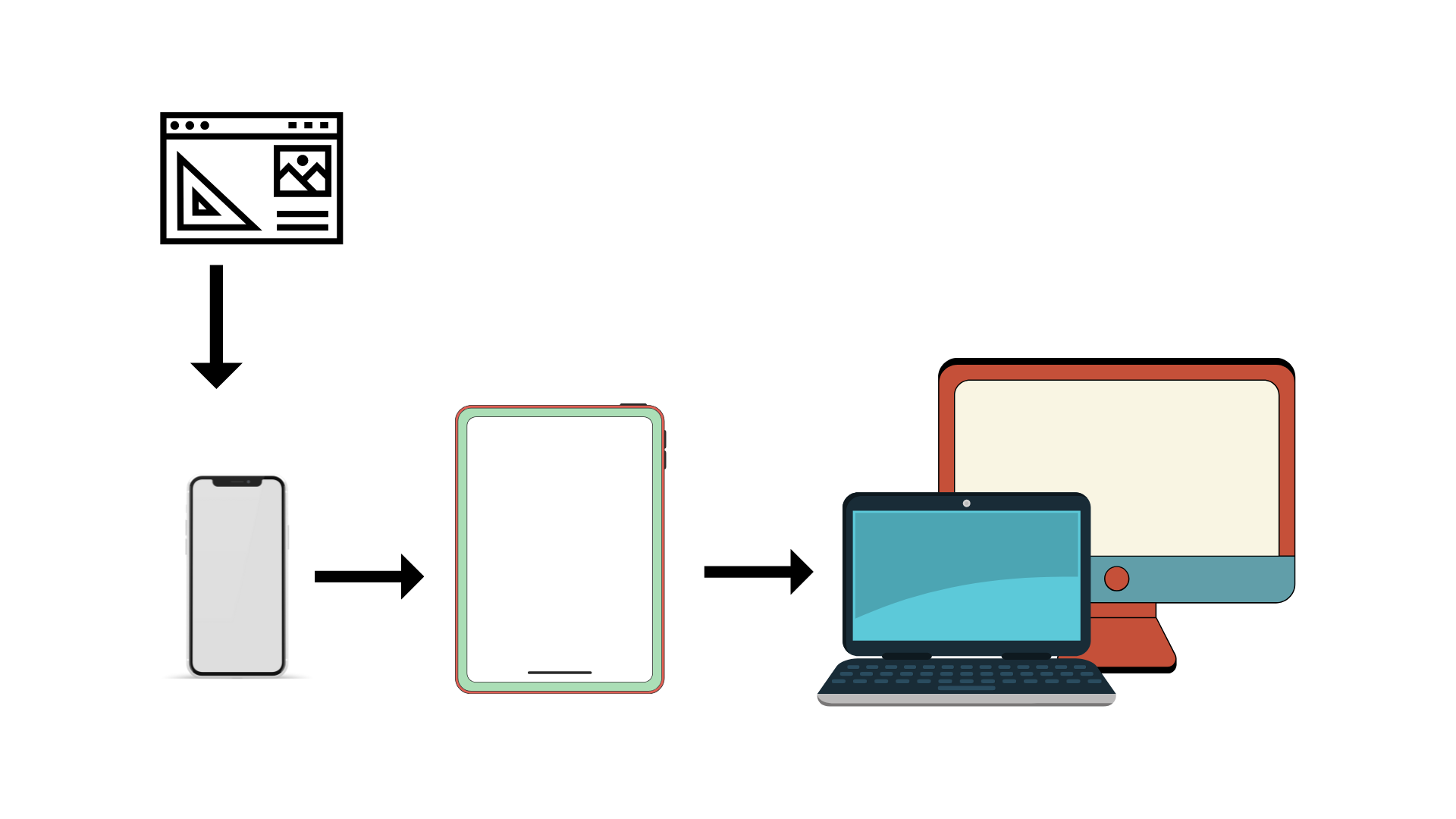
This ensures a focus on essential content and a streamlined experience for smaller screens.
For example, when you design a simple, single-column layout for smartphones, prioritizing key content and navigation elements, it becomes easier to progressively enhance the design for tablets and desktops by adding more complex layouts and features.
2. Flexible Grids and Layouts
Flexible grids and layouts are an important principle of responsive web design.
Here’s what you need to do: use fluid grid systems and flexible layouts based on percentages instead of fixed widths.
Why? This allows content to adapt smoothly to different screen sizes and orientations.
Instead of setting fixed pixel widths for columns, use percentage-based widths to create a grid system that adjusts proportionally to the viewport size.
For instance, instead of telling a column to be 50 pixels wide, you say it has to take 50% of the screen. 50 pixels on one device might look good but on others, it might be too much or too little.
50% of the screen, however, would look similar on all devices and screen sizes.
3. Optimize Images and Media
Images are great for any website. They add a visual appeal that can go a long way in attracting, retaining, and converting visitors into customers.
However, in responsive website design, images often pose the biggest challenges.
Thus, you need to optimize images for different resolutions and screen sizes to minimize load times and bandwidth usage.
Use responsive image techniques to serve appropriately sized images based on the device’s capabilities.
For example, you can implement CSS rules such as `max-width: 100%` to ensure images scale down proportionally to fit smaller screens without losing quality. Additionally, you can use the `<picture>` element or `srcset` attribute to deliver different image resolutions based on device pixel density.
4. Media Queries for Breakpoints
Media queries are CSS features that enable developers to apply specific styles based on various conditions, such as the device’s screen size, resolution, and orientation.
With media queries, you can target adjustments to the layout, typography, and other design elements.
For instance, by using media queries, developers can define breakpoints—specific points at which the layout should adapt to different screen widths. At these breakpoints, the CSS rules defined within the media query will take effect, allowing for responsive design adjustments.
Here’s how media queries can be utilized:
Step 1: Set breakpoints at key screen widths, such as 768px for tablets and 1024px for desktops.
Step 2: Within the media queries, specify styles to apply when the viewport width meets the defined breakpoints.
For example, at narrower breakpoints, a single-column layout might be more suitable for smaller screens, while wider breakpoints may warrant a multi-column layout for desktops.
5. Cross-browser and Cross-device Testing
Don’t take the designer’s word for responsive website design.
Test the responsive design across various browsers, devices, and screen sizes to ensure consistency and functionality.
Identify and address any layout or usability issues that may arise.
For this, you can use browser developer tools and online testing platforms to simulate different devices and viewports. Additionally, conduct real-world testing on actual devices to assess performance and user experience across different environments.
By following these responsive web design best practices, you can create responsive websites that deliver optimal user experiences across a wide range of devices and screen sizes.
SynergyTop’s Responsive Web Design Services
Responsive website design is no longer an option today. It is the need of the hour.
This is where responsive web design services come into play.
As a leading responsive web design company, SynergyTop understands the importance of creating websites that are not only visually stunning but also functional across all devices.
Our team of experienced designers and developers specialize in offering responsive website design services. Our web solutions prioritize user experience and engagement.
What sets SynergyTop apart as a preferred partner for responsive web design services?
It is our commitment to excellence and innovation.
- We take the time to understand your unique business requirements, target audience, and brand identity, allowing us to tailor our solutions to your specific needs.
- We have a team of skilled designers and developers who are well-versed in the latest trends and technologies in responsive web design.
- We believe in fostering strong partnerships with our clients, collaborating closely throughout the design and development process to ensure alignment with their vision and goals.
- We have rigorous testing processes in place, which ensure that your website performs flawlessly across all devices, browsers, and platforms.
Moreover, our relationship with you doesn’t end with responsive web development. Once the website is launched, we provide ongoing support and maintenance services.
As a part of our ongoing responsive web design solutions, we continue optimizing your website to ensure that your website remains responsive, secure, and up-to-date.
Looking for responsive website design services? Get in touch with our UI/UX design team today to elevate your online presence and stay ahead of the competition.


