+1 619-349-4911

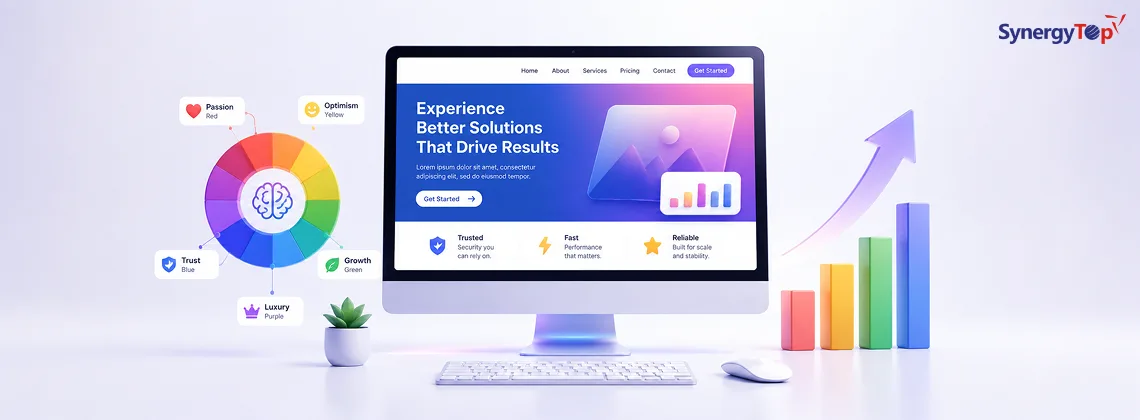


Did you know that colors can influence up to 90% of the initial impression?
Moreover, 93% of shoppers focus on the visual element while making a buying decision.
Also, colors influence the purchase decision for 85% of customers.
Further colors can also boost brand awareness by 80%.
All these statistics show that using the right colors is key to your business’s success. But if you believe that color psychology is important only in product design and logo design, think again.
You can also leverage color psychology on your business website to boost conversions.
How?
By using the right kind of images, text highlight, CTA button colors, etc.
Now, if you think finding “the color” that will boost conversion for your website is as simple as a Google query, you are mistaken.
The ‘Conversion boosting color’ differs for each brand.
It is 100% true that colors evoke specific sets of emotions in people. But emotions are not always the same. And neither are the results of the colors.
Here’s an example of how the ‘conversion boosting color’ varies from brand to brand.
Hubspot saw a 21% increase in CTR after changing the color of its buttons from green to red. However, Optin Monster still uses green CTA buttons. They wouldn’t be doing that if they weren’t getting desirable CTRs, right?
So then what color should your CTA button be?
Well, here are 5 factors to consider while picking the colors for your website.
5 Factors To Consider While Picking Colors For Your Website
1. The Logo
Blue indicates trust. But if your logo is bright sunny yellow, a blue website won’t look and feel trustworthy. It would feel foreign and unrelated to your business, to say the least.
Thus, it is important to make sure you pick those colors for your website that match or complement your logo.
2. Your Audience Demographics
 Color preferences vary according to demographics. Many research studies have proven that.
For example, while teenage guys tend to like denim blue, middle-aged men would prefer pebble black.
Similarly, 2 to 10-year-old girls are the most attracted to tiffany blue. But 20 to 30-year-old females have a higher inclination toward cherry red.
Thus, you need to make sure you pick colors that appeal to your target demography.
3. Cultural Factors
How colors are perceived varies from culture to culture.
For example, while white is universally accepted as a sign of peace, it means different things in different cultures. In the American culture, white is used in weddings and is considered pious. In China, Korea, and some Asian countries, however, white is a color worn at funerals and is associated with death, mourning, and bad luck.
Thus, a wedding website with a white theme would work great in the US but fail terribly in India.
Another example of culturally-different perceptions of color is red. Red evokes danger and caution in the Middle East. But in India, it is the color of purity, that brides wear during weddings. And when combined with green, it becomes a festive color – the theme of Christmas – in western countries.
Thus, for global businesses, especially, selecting the correct color for the website becomes very important. If not, you stand a risk of offending some sections of your audience.
4. Usability
Black, though sometimes related to negativity and mourning, is generally used to denote luxury and sophistication.
Now say you pick black for your luxury clothing website. But the color of the clothes that you want to display on your side, won’t pop with a black background. Here, it comes important to give preference to usability.
The font, background, and accent colors need to make sure that the visibility and usability of your user interface are not compromised.
5. Don’t Forget White
When choosing colors, most website owners forget white. Other than being a symbol of peace, purity, and tranquility, white also offers much-needed relief from the array of colors that surround us.
In content, for example, white space between walls of text is important to make reading easier. Web users won’t take the pains of reading long blocks of running text like academic readers. They need breaks and white spaces which ease the eye.
Also, when you want your images or other multimedia content to pop, white is most likely to be the best background choice.
Final Step – Try & Test
 You can consult the brightest minds and the best books on color psychology for choosing the colors for your website. But that does not guarantee conversions. Why? Because humans are unpredictable, no matter how much data and insights you have about them.
Thus, to optimize your website’s color scheme for conversions, you need to test the options with real users. Whether it is your logo, landing page, or graphics, make sure you A/B test everything before finalizing.
You can seek public opinion via social media polls, using split testing tools, or by gathering consumer feedback in focus groups or via review forms.
Leverage Color Psychology For Your Business Website Today
All set to start leveraging color psychology for your business website? Start by finding a team of expert and experienced website designers and developers.
The right team will not just help you design a visuall-appealing website, but also work for conversion optimization and ultimate user satisfaction.
SynergyTop is a full-service IT development company with a team of 50+ website designers, developers, QA specialists, and digital marketers. Our in-house team can work on your project from start to finish and deliver better-than-expected results within budget and on time.
Schedule a one-on-one consultation with our web development team to discover the possibilities for your business website needs.