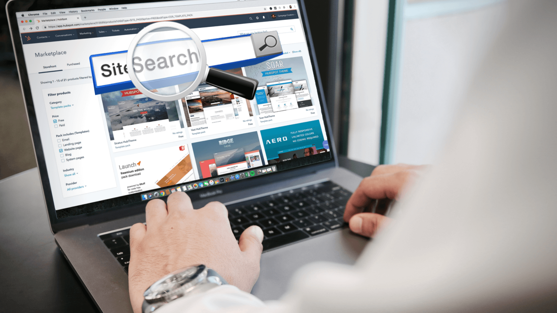
Search is the most prominent communication between the user and the system. A user performs a query from the application search box, and the system responds as a set of results. The results page is the most crucial page of the search experience. This blog talks about the best practices that need to be followed or implemented in search-based Applications.

Mobile Compatibility
Mobile search is not like desktop search, and trying to assimilate vast information into a small screen is only causing your users endless frustration.
Nowadays, customers are limited by the small screen and tactile search and filtering. Hence the best mobile search experience has to be built with these requirements in mind. Having a large, prominent search box, together with a relevant auto-complete/type-ahead feature and fast return of results can make an incredible difference in the user’s shopping and search experience.
Type-Ahead/Auto-suggest feature
Inapt auto-suggestions deliver a poor search experience. Ensure that the autosuggestions are useful and relevant. Some helpful functions include recognition of root words, predictive text, and suggestions when the user enters text. They help speed up the search process and keep the users on-task toward conversion.
Auto-Correction
Sometimes the users make a typo error while entering keywords into the search box. If a user misspells or makes a typing error while entering the keyword, you can detect it with the help of auto-correct; correct it, and revert with suggestions of the correct keywords. This assists in avoiding any discontent caused by zero search results and making the user enter the search term again.
Merchandising Feature
We can promote specific items in the search results by using the Merchandising feature. It also helps in displaying our chosen products in the featured items section to ensure the higher attention of the users. This can also be used to put items on sale under this section.
Transform Frequently Searched Terms into FAQs
If users are searching for similar terms more often, then it becomes a great need to convert these search terms into FAQs. This helps to display the correct and most accurate result set to the user. We can also save these searches into saved searches and can give an option to a user to see these searches in the future.
High Visibility Of The Search Box
The most important rule in the search box design is to make it easily noticeable. If the search feature is an important function for your app/site, it should be displayed prominently, as it can be the fastest route to discovery.
Search Box With Magnifying-Glass Icon
Icons are, by definition, visual representations of an object, action, or idea. There are a few icons that have mostly universal recognition from users. The magnifying glass icon is one such icon. Users recognize a magnifying-glass icon as meaning ‘search’ even without a text label.
Tip: Use the simplest version of the magnifying glass, because fewer graphic details speed up recognition.
Placement Of The Search Box
There is no thumb rule for this but most of the sites/apps prefer to have a search box in the top center or top right section of the page. Placing it somewhere unexpected may need the users to put in extra effort to find the search box.
Provide A Button For The Search Box
Even though the search can be easily performed by hitting the Enter key, some users still search for the more traditional “submit” button. A button also helps people recognize that there’s an additional step to perform the search action, even if they decide to do this by pressing Enter.
Placing The Search Box On Every Page Of The Application
The users are most likely to use the Search feature when they can’t find the content they are looking for. The users can browse any page of the application and would want to search from any of the pages. So it’s good to have the search option on each of the pages.
Search Text Field Size
The Search Box should be long enough for the users to view the entire text that they key in, review, and/or edit their complete query. When a search box has a limited number of visible characters, the users tend to use short and imprecise queries, since the longer queries are inconvenient to read. The input fields should have an appropriate size that enables the users to easily read and interpret.
Don’t Remove The Search Query
I advise you to keep the original search text. If the users do not find their desired results, they may wish to search again using a slightly modified query. To make it easier for them, leave the original search query in the search box so they do not have to re-type the entire search term again.
Show The Number Of Matching Results
Show the number of search items available, so that users can decide on how long they want to spend looking through results.
Show The Search Progress
Ideally, the search results should be displayed immediately! However, if that is not a viable option, a progress indicator should be used as system feedback for the user. You should give your users a clear indication of how long they need to wait. If the search takes too long you can use animation. Good animation can distract your customers and make them ignore long search times.
Say No To The ‘No Results’ Page
Displaying a page with no results can be frustrating. Especially if they have tried the search a couple of times. You should avoid giving users dead-ends in their experience when their search produces no matching results. Provide alternatives when there are no matching search results.
Provide Sort and Filter options
The users may get overwhelmed when their search term result in seemingly irrelevant and/or too many results. You should provide the user with filtering options that are relevant for their search, and enable them to select multiple options each time they apply to filter results.
Good Search is Good UX
Search is a fundamental activity and a critical element of building a content-heavy app or site. Even minor changes such as a proper size for the input field or indicating what information goes in the search field can significantly increase search usability together with overall UX.
About SynergyTop
SynergyTop is among the top eCommerce development companies that provide custom E-commerce development services. We offer services related to technologies including Oracle Commerce and Oracle Commerce Cloud technologies. We can help you with Oracle Endeca Guided search, Page management and layout, content placement, and dynamic delivery of products, personalization strategies, and contextual merchandising.
Write to us at contact@synergytop.com for details!


